
A calmer island starts with spacing (not brute brightness)
If your island looks moody in spots and blown-out in others, you don’t need more wattage—you need even distribution. Spacing and count determine whether light reads as a continuous “tablecloth” of illumination or a string of hotspots. Add diffusion and gentle color/brightness control and the island goes from harsh to hospitable.
Height note (one line): If you still need a number, the bottom of the shade ~30–36 in (76–91 cm) above countertop is the liveable band—see our dedicated Pendant Height Playbook for the why & edge cases.

Spacing: the “2× diameter” rule that survives most kitchens
Baseline: For equal pendants, set center-to-center spacing ≈ 2 × pendant diameter.
-
Example: 12 in (30 cm) shades → ~24 in (61 cm) center-to-center.
-
Edge clearance: Keep 6–12 in (15–30 cm) from pendant edge to island edge so the first/last shade don’t crowd corners or blast edges.
Why it works: At ~2×, the beam skirts “kiss” rather than collide, creating a continuous pool without bright peaks and dark gutters. It’s predictable, easy to mark, and scales with shade size.
When to deviate (on purpose)
-
Big drums (≥16–18 in dia): Open the spacing a touch beyond 2× so the composition breathes and cut-off stays comfortable.
-
Slim minis (≤8–10 in dia): Slightly compress (just under 2×) or add a third/fourth on long runs to avoid scalloping.
-
Mixed sizes / asymmetric styling: Anchor the largest shade to the visual center (sink/cook zone), then mirror gaps outward so cones still overlap evenly on the surface.

Count: pick by cone overlap, not by vibes
Quick brackets by island length
-
≤5 ft (≤152 cm): 1 medium or 2 small
-
5–7 ft (152–213 cm): 2 pendants (most kitchens)
-
7–9 ft (213–274 cm): 2 large or 3 small/medium
-
≥9 ft (≥274 cm): 3 pendants or a linear multi-light
Cone test (the no-math check): Stand on a stool and point a soft flashlight through a napkin where each pendant center will hang. If pools just touch across the counter without strong bright “buttons,” your count is right. If you see dark rivers, increase count or tighten spacing slightly (while keeping edge clearance).

Diffusion & glare control: see glow, not source
Pendants live eye-to-eye with people. Comfort beats raw punch.
-
Diffusers: Choose frosted/opal lenses or closed bottoms to hide the emitter and soften specular hits on polished stone.
-
Cut-off: Shades with some cut-off angle keep the brightest zone aimed down, not straight across into seated eyes.
-
Interior finish: Matte / brushed interiors read quieter; mirror interiors sparkle but can feel sharp at dining brightness.
-
Beam logic: Integrated LED modules with wide floods are forgiving for general islands; narrow beams make dramatic highlights—use sparingly to avoid patchiness.
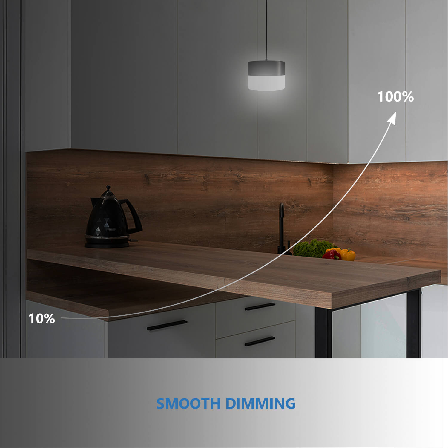
Reflection control (stone & steel): If an opposite bank of tall stainless or a glossy fridge catches reflections, nudge spacing or dim 5–10% at mealtimes to mute mirror-like artifacts.

CCT & dimming: cook clear, dine warm (no “smart” required)
You can get two useful “moods” with a listed LED dimmer and, if your model supports it, an on-fixture 5CCT selector.
-
Prep / cooking:
-
Color: 3500–4000K (neutral-warm → neutral) for edge clarity and true food color.
-
Level: ~60–80% for task pop without glare.
-
-
Dining / conversation:
-
Color: 2700–3000K warms skin and stone.
-
Level: ~20–40%; let ambient/cabinet lights carry the room.
-
If your pendants are fixed-CCT, pick 3000–3500K as a do-everything color and rely on dimming for mood.
Driver & flicker note: Low-level shimmer is usually a dimmer–driver mismatch. Swap dimmers before replacing fixtures; manufacturers often list tested models.

Sightlines, stools, and talk across the counter
-
See faces under the rim: From seats, you should see the person opposite under the pendant edge. If shades block eyes, either slim the profile or widen spacing slightly (keeping edge clearance).
-
Seat mapping: Align shade centers between stool centers so no one sits under a bright centerline.
-
Screens & hoods: If a range hood or a wall screen lives opposite, check that the pendant’s bright side isn’t reflecting straight into it.
Common mistakes (and quick fixes)
| No. | Mistakes | Symptom | Fix |
| 1 | 2× rule ignored → hotspots/gutters | Bright “buttons” under shades, dark lanes between. | Nudge toward center-to-center ≈ 2× diameter, verify with a cone test. |
| 2 | Edge crowding | Corner pendant blinds you when leaning on the edge. | Hold 6–12 in edge clearance from pendant edge to island edge. |
| 3 | All punch, no diffusion | Polished tops look sparkly and fatiguing. | Add frosted/opal diffusers or dim 10–20% at meals. |
| 4 | Pretty but piercing interiors | Glossy shade interiors act like mirrors. | Choose matte/brushed interiors or increase cut-off. |
| 5 | Wrong dimmer | Shimmer at low levels | Swap to a driver-compatible LED dimmer from a tested list. |
| 6 | Count chosen by symmetry only | Looks balanced but surface is uneven. | Choose by cone overlap; add a pendant or adjust spacing. |
Mini How-To: spacing tape-test (10–15 minutes)
Supplies: painter’s tape, paper circles (shade size), tape measure.
Goal: Validate spacing, count, and edge clearance before you drill.
-
Mark centers using either 1/3 & 2/3 (two pendants) or 1/4, 2/4, 3/4 (three).
-
Place paper circles at each center using the actual shade diameter.
-
Apply the 2× check: measure center-to-center ≈ 2 × diameter; adjust for edge clearance (6–12 in from pendant edge to island edge).
-
Cone simulation: Shine a phone flashlight through a napkin at each center—look for just-touching pools on the countertop.
-
Seat & stand test: Sit on each stool, stand at the prep zone. If a circle intrudes in your eye line, tweak centers ±2 in and recheck.
-
Night test: Kill other lights and repeat the cone simulation; fix any gutter between pools before committing.
Quick checklist (print/save)
-
Spacing: center-to-center ≈ 2 × diameter
-
Edges: 6–12 in from pendant edge to island edge
-
Count: choose by cone overlap (no dark gutters)
-
Diffusion: frosted/opal or closed bottoms for comfort
-
CCT/Dim: 3500–4000K @ 60–80% prep; 2700–3000K @ 20–40% dining
-
Sightlines: see faces under rims; map centers between stools
-
Dimmer: LED-compatible, driver-matched; fix shimmer by swapping dimmer
-
Tape-test: day & night cone checks before drilling
-
(Height cross-link): 30–36 in guide → see Pendant Height Playbook
FAQs (fast answers)
Q: What’s the simplest spacing rule?
A: Center-to-center ≈ 2 × pendant diameter, with 6–12 in edge clearance. It keeps pools touching without hotspots.
Q: Two or three pendants?
A: 5–7 ft islands: 2. 7–9 ft: 2 large or 3 small/medium. ≥9 ft: 3 or a linear. Decide by even surface light, not just symmetry.
Q: How do I avoid glare on polished stone?
A: Use frosted/opal diffusers and a bit of cut-off; dim 10–20% for meals.
Q: What color works for prep vs dining?
A: 3500–4000K @ 60–80% for prep; 2700–3000K @ 20–40% for dining. If fixed-CCT, 3000–3500K plus dimming is a safe all-rounder.
Q: Where’s the height guide?
A: See our Pendant Height Playbook (bottom ~30–36 in above countertop) for the full rationale and edge cases.